


Hill Top Real Estate is a boutique, family owned real estate company serving the greater Los Angeles and southern California area. Since they opened, Hill Top mainly relies on referrals to have their company brand continue to grow. Combine this with great customer service and vast experience in real estate/construction and Hill Top will retain and attract new clientele for the time being. However, with a growing need to modernize and attract Millennials, it means they now need to redesign their website to help keep up with the times. They have asked for a website redesign to help attract their new target audience.
The users experience is paramount here. They will be interested in a frustration free experience that is quick and to the point as well as feeling confident and comfortable with what they are looking to accomplish. After all, buying a home will most likely be the biggest purchase of the clients life.
Something noteworthy about this real estate company is that they not only help with the selling and buying of homes but also assist future clients with their construction needs as they are a licensed contractor as well.
The website will need to convey these main messages by using images that convey a certain feeling and easy to find information. I also chose to design with a “less is more” mindset. A decent amount of white space will be used to help keep the feel modern and attractive.
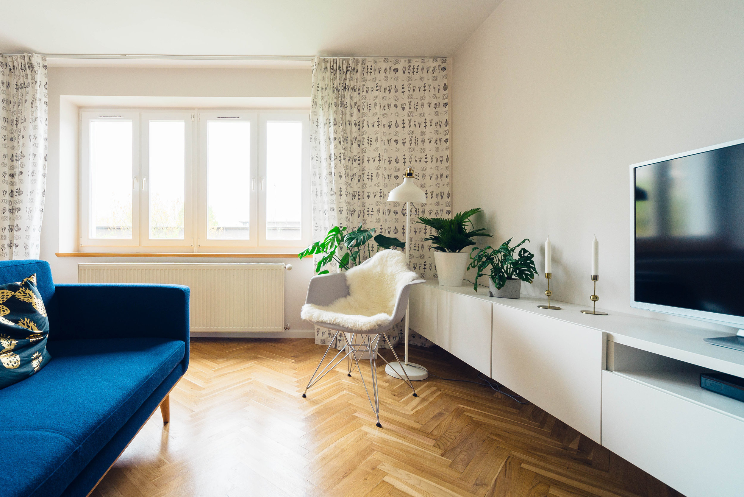
A survey was conducted with a group of individuals ranging from 28-38 years old on what photo and color scheme was more inviting. The photo above was selected due to the comforting nature and was then paired with a simple layout and dark contrasting color scheme for modern feel. Verdana was chosen as the typeface to help tie in the contemporary flow of the site. Because Hilltop is targeting an audience of younger home buyers it was purposely done to survey that age group to help empathize with what they are attracted to.
By doing rapid sketching with the low fidelity design ideas I was able to render a general flow of what I wanted for the website. Since their target client is new home owners in their 30’s, I tried to keep it relatively simple and clean. I used a single page design that the user can quickly scroll through to find where they wanted to go. Once confirmed with the stakeholders I was able to move forward with a more high fidelity design in mind.
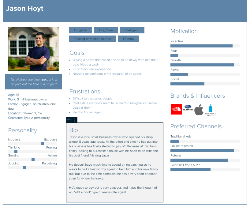
I used one main persona for a user who could represent the target audience of this company. This is a young person who is interested in purchasing a home but has a few needs that will have to be met first.
One specific request made by the client was to create a new layout for their “Our Team” page. I decided to create specific set of pages just for that. By clicking on the “Our Team” button it will bring up a new page showing a quick layout of who’s who in the office. Clicking on their picture will then bring up a detailed page of who they are, what they specialize in, their current listings and a contact box. The image chosen for the background was selected because of the inviting and comforting nature that living rooms give to users.
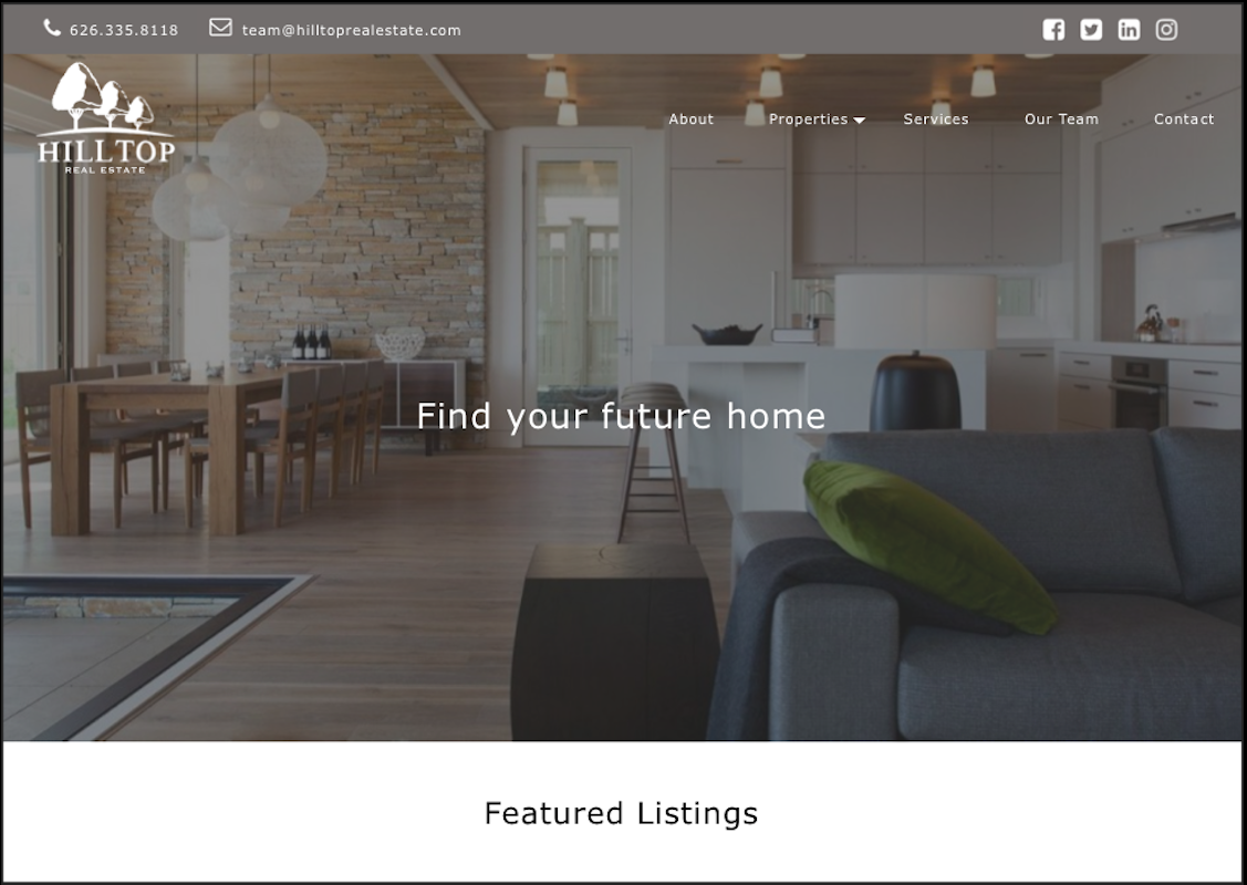
The landing page for the desktop website was designed to be simple and easy to follow. My focus was to make sure that the user was able to find what they were looking for and quickly. I helped move the company away from a dated flat website design to a more modern one by using signifiers on buttons and text as well as shadows on boxes that have a purpose.