


For this case study, my team and I were given a challenge of improving Service Design in a restaurant environment.
What does Service Design consist of?
In this day and age, where almost all things are connected, the user now has certain expectations when it comes to service and a friction free experience. Thus, a digital menu was the focus of this design.
To begin we needed to create an ideal restaurant experience, a sort of blueprint. Something that the client would go though during their visit with our device.
Based on our blue print, these sketches were created to show the customer experience from before they even stepped into the restaurant to the customer walking out satisfied. The customer should be able to easily make a reservation in various ways, get an alert to confirm the reservation with the host, receive superior customer service from either their assigned server or a by self-service tablet, receive food in a timely manner, and lastly, the customer should be able pay for their meal easily and quickly.
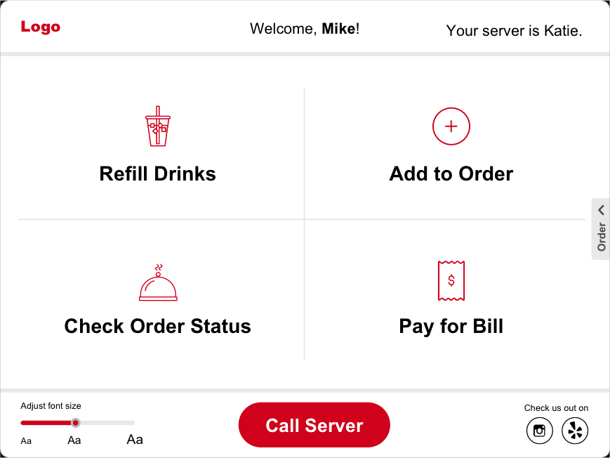
We wanted to focus on designing a self-service system that allows the customer to put in their orders, request for refills, have transparency of the process of how long it’ll take for their order to arrive, and enable them to make payments all by themselves without having to flag down a server to bring them their check. We are aware that even though ideally the customer should be able to use the self-service system without any issues, we still want to provide great customer service. A ‘Call Server’ button is available for assistance at any phase of the experience just in case.
We had 6 participants in our moderated usability testings. The participants were asked about their dining habits, preferences, and they were asked to perform a series of tasks to test out the prototyped. After we analyzed the results, we grouped the answers in an affinity diagram to help visualize any trends and painpoints.
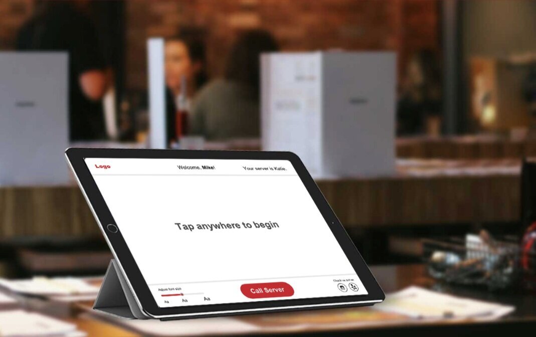
The main landing page shown above was designed to be as simplistic as possible to help minimize user error. We were shown though testing that once the user makes the first click to start the ordering process they are much more likely to continue though and be happy with the design.
User has the ability to add or remove items from menu. The summery order is collapsible to the right of page to not only save space but to give the user as much information about their order as possible when needed. It was shown that users want to have this available to them when called upon but did not want to have it shown constantly due to the clutter.
Shown above is the main control page where the customer is able to control many of their dining experiences. The Call Server button as well as a font settings button are always located at the same place on each page to help minimize friction for the user. Font was chosen due to the familiar yet modern nature of Verdana. While the color scheme of red with white was chosen because warm colors are naturally appetite-stimulating and bring about passion and confidence for the viewer.
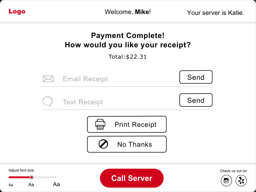
Several options are made available to pay for the bill. I’ve added the split bill feature after user testing showed it to be a highly desirable feature.
In the end our goals hadn’t changed. We were able to design a full service device that helped not only the user but the backroom staff as well. Simplicity was key here. The take away we found was that traditional customer satisfaction at a restaurant is good service and good food, however, when you take away the human interaction the new “good service” is simplistic design and easy to follow flow/information for the user to enjoy.