Optum Specialty Pharmacy (OSP)
For this project I was tasked with designing an enhanced onboarding flow and a new dashboard experience aimed at improving user engagement and simplifying the navigation of prescription benefits for our patients. The challenge was to create an intuitive, seamless experience that would not only educate new users quickly but also streamline the management of prescriptions through a modernized, user-friendly interface.
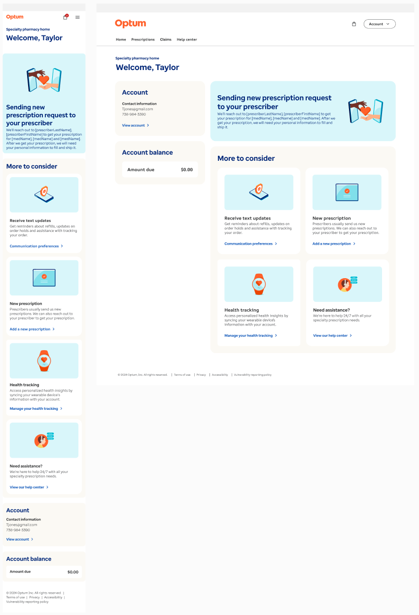
By conducting user research, including interviews and usability testing, I gained valuable insights into the pain points of OSP’s users. This informed the design of a personalized, step-by-step onboarding flow that guided users through their first prescription fill and drug management, while ensuring accessibility and ease of use for all ages. Additionally, I worked on revamping the dashboard, prioritizing clear information hierarchy, easy access to critical actions, and a responsive design that adapts to diverse devices.
The result was an optimized, cohesive experience that enhances user satisfaction and engagement from the moment they join the platform. Through this project, I aimed to not only meet the business goals of OSP but also deliver a user-centered design that fosters long-term loyalty and ease of use.
Overview: Product to allow members to onboard successfully and manage their prescription
Role: Senior Product Designer
Software: Figma, Rally, Miro, Teams, Adobe Suite
Product: Mobile first (MWeb) responsive design
Timeline: 8 months
Want a quick look at what was done? See it live on the Optum website or select the button to see a prototype.
"Pharmacy Benefit Managers (PBMs) like Optum play a critical role in streamlining and helping bridge the gap between patients, pharmacies, and insurers, ensuring that the right medications are delivered at the right price to those who need them most."
On average, OptumRx members save around 30% on prescription medications through a combination of lower copays, discounts, and access to generic alternatives.
A growing need…
Even though less than 2% of the population uses specialty drugs, those prescriptions account for a staggering 51% of total pharmacy spending
However, due to the COVID-19 pandemic there was a significant delay in care which resulted in delayed diagnoses of specialty conditions. For example cancer screenings significantly declined (mammograms by 87%, colonoscopies by 90% and pap smears by 83%). This indicates that the market is expecting a rebound of visits and specialty patients to come, which will drive up specialty drug needs.
The Problem
As a recently diagnosed specialty patient, who is already stressed, scared and overwhelmed from being diagnosed with a specialty condition, I want to be able to quickly onboard, request my prescription and have a clear and easy way to start my treatment.
Phase 1: Ground work
Don’t Reinvent The Wheel
For this project, I planned to leveraged Optum’s well-established component library and some of the original screens as a foundation to streamline the design process, saving both time and effort. By utilizing the components, I was able to ensure consistency across the interface while focusing on the unique aspects of the user experience. This approach allowed me to avoid "reinventing the wheel," enabling a faster delivery without compromising quality. It also ensured that the design was built on a solid foundation of best practices, leading to a more efficient workflow and a polished, cohesive end product. Additionally, the component library is A11Y-approved, meaning it adheres to accessibility standards, ensuring that the design is usable for people with a range of abilities. Using an established library was not only a time-saver but also a smart decision for delivering a reliable, scalable, and inclusive design.
How is it currently being done
Lets take a look…
Does not utilize an ID verification
Has brick and morter
Singular flow with split for current/not current members
Uses a simplified dashboard with notifications as “chips”
Patients are already users of parent product
No brick and morter
Must be a member of Amazon Prime or One Medical
Dashboard located within Amazon Prime app
Uses an ID verification
Has brick and morter
Singular flow with split for current/not current members
Very dense dashboard with information about things other then current order
Current Pain Points
No streamlined singular flow to onboard new users
If patient tries to onboard before they receive a prescription email they see an error screen
We found that there are 5 different personas that the current design needs to manage.
Personas before email
OSP user, has new therapy
Non OSP user, has IRIS info, has new therapy
Non OSP user, no IRIS info, has new therapy
Personas after email sent
OSP user, has new therapy
Non OSP user, has IRIS info, has new therapy
The new design will utilize a dynamic form/flow that will help limit the personas to 3 and will allow them to onboard even before they receive the prescription email.
Service Blue Print
What is a Service blueprint?
It’s a detailed visual map that outlines the entire user experience journey, including both front-end interactions and back-end processes. It highlights the key touchpoints, stakeholders, systems, and actions required to deliver a seamless experience, helping teams identify potential pain points, gaps, and opportunities for improvement.
Collaborating with my Product Manager to create this blueprint at the beginning of the project was essential, as it ensured alignment between design and business goals, helped prioritize features, and established a clear roadmap for execution. The early collaboration set a strong foundation for the project, ensuring that Dev, Design and Product all worked toward a unified vision.
Boiling it down
Taking what we made in the service blue print I was able to create a first draft of what multiple persona journeys would look like in the new design.
Phase 2: Define
User Personas and happy path defined
Returning user flow. Customer journey maps help to give us a visual perception on not only where the frustrations lie in their journey, but also how they are reacting to their frustrations and what methods of resolve they try to accommodate to improve their own satisfaction. In this journey map, you can see how the user goes from unhappy and frustrated to understanding and okay once they go through the process of dealing with their specialty prescription request.
New user flow. This journey encompasses a two fold path where part of it is in an un-auth state (not logged in) and an auth state (post verification/logged in) due to legal restraints dealing with medical information that is protected.
Research Tools Used
User interviews
For this project, we conducted user interviews via teams with 6 people to gather insights and confirm assumptions to ensure the design met user needs.
During User Interviews- Here's what we gathered:
A common pain point is how they have to wait to register.
Confusion at what to do once they finish onboarding.
Post User Interviews- This allowed us to solve it by:
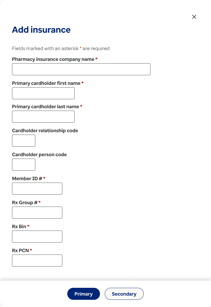
Ensure there’s a way to “pre” onboard and request a new Rx.
Make sure there is clear messaging once they finish onboarding on what they need to do next.
Redesigning and making sure the Help Center section was accessible and clear to all users.
These research methods ensured that the final design was user-centered, addressing both broad concerns and specific individual needs.
Phase 3: Justify the Need
Target Audience & Basic Need
Who stands to benefit?
All specialty users stand to benefit not only from a new onboarding process but from a revamped Dashboard and Help Center.
Behaviors
Most are new users who are not going to be familiar with the site
All will be very nervous and skeptical due to the fact that they just got diagnosed with a severe condition.
The opportunity
Redesign with accessibility in mind
We’ve outlined the basic structure for the future flow. Since the old designs contained loops, broken links, error screens, and redundancies within the site as a whole, we decided to expand the initial project—originally focused solely on onboarding—to also include a redesigned dashboard, the ability to request a new prescription, and an updated Help Center with accessibility annotations.
Phase 4: Low-Mid Design
Mid-Fidelity
Lean into what’s available to you
Utilizing an established design system with a component library really helped to enable a fast delivery and build by using common components and allowing me to focus on the user flow. It also ensured that the design was built on a solid foundation of best practices, leading to a more efficient workflow and a polished, cohesive end product. Additionally, the component library is A11Y-approved, meaning it adheres to accessibility standards, ensuring that the design is usable for people with a range of abilities. Using an established library was not only a time-saver but also a smart decision for delivering a reliable, scalable, and inclusive design.
Phase 5: Hi-fidelity
Final Iteration and documentation
Comprehensive Documentation for a Seamless UX-to-Dev Handoff
Good UX stands out by providing clear, detailed documentation for their work. I ensure that the Development team not only understands and are involved in my designs from the start but can also easily find answers to any questions by referring to the specifications. This approach streamlines the UX-to-dev handoff, giving developers everything they need to implement the design accurately.
The documentation includes key elements such as screen layouts, error scenarios, interaction states, user flows, functional specifications, spacing, UI components and their behaviors, and A11Y notes, ensuring a consistent user experience across all users and their devices. Ultimately, detailed specifications bridge the gap between design and development, ensuring the final product meets both design intentions and technical requirements.
As shown in the image below, each design element is clearly annotated. This clarity minimizes handholding, shortens development cycles, and ensures the final product faithfully reflects the initial design vision.
You can take a closer look at an example of my documentation style for the Dashboard redesign by selecting the link.
Finished
Thanks for reading to the end! Want a closer look at what was done? Check it out live on the Optum website or select the button to see a prototype.


